Scoobyclub
Member
Hi, I fed back on some issues a while back for the OS X version but it hasn't been updated in a while so I thought I would feedback some more.
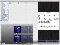
I have attached a screenshot of how things open up by default to show how the defaults/smartness of sizings and placements could be improved. If they can't be improved it would be useful if more things were remembered for subsequent openings. Anyway to note :
1. The guitar chords are never sized and placed so that they fit neatly in the space available without often being missed or cutoff. This means you have to keep selecting/resizing etc depending on the number of chords and variations. Don't see why they can't be shown in full all the time.
2. The title/composer list always defaults way too big, much bigger than the chord chart itself. The last size is never remembered.
3. The font size/spacing means that complex chords often are written over the top of each as in the example given. Resizing makes no difference.
4. I still get the "Times", or repeats as I would call it, coming up with strange, high values. This evening the song shown actually opened up with 500 repeats.
I still get tons of use out of this great tool but I think it needs a little love in the usability/UI dept when resources allow. I am sure the iOS version ( which I also have ) is the most lucrative but for home editing and practice I find the OS X version more useable from a screen size/keyboard/bigger sound perspective.
Regards
Colin McGowan